User Manual
How to use this powerful tool
Find your way through Chicago
The main purpose of this application is to help users make more informed choices for how they want to get from
point A to point B on the map of Chicago.
To do this, the users can choose between two different types of selection of the path, between different
enabled layers of data and they're also able to select the desired temporal interval for the past data
displayed. Moreover, a comparison between the city as a whole and the selected area is always available to get
even more insights about the characteristics of a path.
In this manual page we will explain the details about all the features of the app.
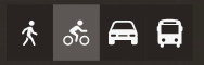
Controls
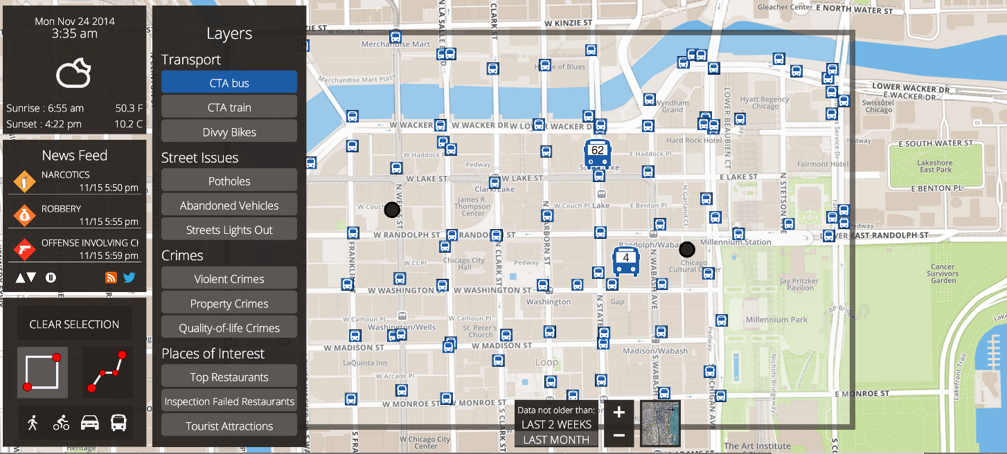
As we can see from the following picture, the app has plenty of controls to interact on a wide range of different aspects.
Let us see in detail every control.
Day control
In this app the control for the day information is not interactive, since the app automatically and periodically retrieves data about real-time hour, weather and temperature. It also shows the current date and hours of sunrise and sunset.
Selection control
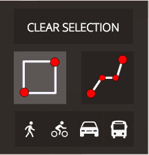
The two main buttons here are those which allow to change type of selection of the area of interest on the map:
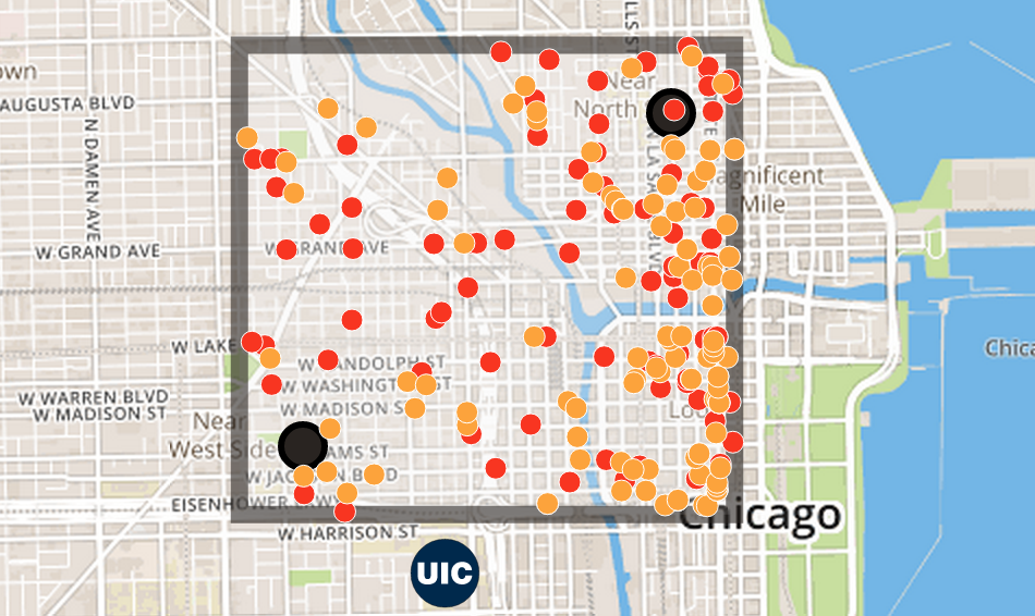 Rectangular Selection
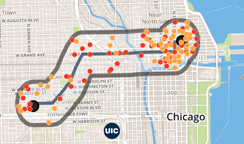 Custom Path
Rectangular Selection allows to click on the map to pin a point (starting point). On the next
click we pin the arrival point. From now on when we will click on the map the previous point which is closer to
the new selected point will be moved to the new position, thus updating the rectangle (selected area).
Custom Path leverages the use of the Google Maps API to retrieve a suggested path from start to
end. Each new point added to the map here gets considered as a new arrival point and all the previous points are
intermediate points through which the path has to pass.
The area of interest here is a shape which surrounds the path with a distance which is around 2 blocks in
average.
The clear selection button allows to clear all the shapes drawn on the map, so that all the map is cleared
and the user can restart his selections.
Let us notice that we decided not to disable the enabled layers when this button is clicked, since it is
likely that the user wants to draw a new selection, but keeping the layers already activeted (or changing only
few of them).
The selection control contains also another module, the Recommender System, which is here because it
is thought to be primarily used after the user has cleared the selection and/or changed type of selection.
Recommender System
The idea behind our decision to add a recommender system comes from the question: "How can we facilitate the
choice of the enabled layers for the user?"
The answer was simple: we can just ask him to declare which kind of means of transportation he is going to
use. Given this information the system uses it together with the information on the time of the day to predict
which layers are more probable to be of some interest for the user.
For example, if it's night and the user is going to walk, then the system will automatically activate the
layers about the abandoned vehicles and criminality, to let him see if the area is dangerous (especially if
crossed going on foot). The layer of the street lights out will be activated too, since it's night, so this is
an important information. At any time the user can modify (enable/disable) layers.
Layers control
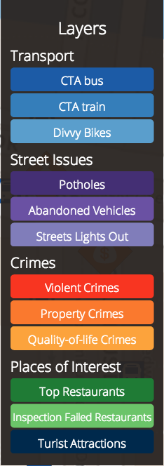
The selection of the layers is one of the key features of the app. This control contains buttons to
enable/disable layers. The layers are subdivided into 4 main categories, each of which is characterized by a
scale of colors in the same range.
In the next section each layer will be described more in detail.
Space and Time controls
In order from the left:
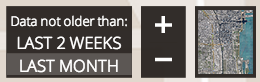
- Time interval control: it lets the user specify which is the time interval to look in the past for data. By default it is set to a month, but the user can select "last 2 weeks" to request more recent data.
- Zoom control: custom zoom to move in/out wrt the map
- Type of map control: by clicking on it the user can change the map from street view to satellite and vice versa.
Layers
Intro
Transport
This section contains data about different means of transportation in Chicago.
CTA bus
By selecting the “CTA bus” label, the layer containing information about the cta bus stations, vehicles and lines is displayed. Once displayed, this layer shows the stations as markers on the map as well as the vehicles travelling around the city.
By clicking on one of these station markers, the lines passing through that station are drawn on the map and a popup is displayed. This popup contains information about the station itself (Name, ID) and time predictions of the next two buses that are coming to that station. Once the popup is closed the lines associated to it are removed from the map.
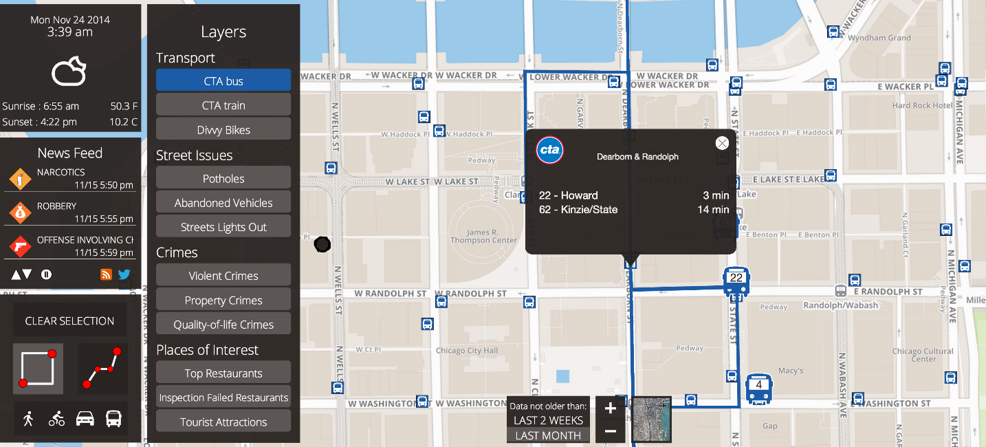
Vehicles positions are estimated according to the last data retrieved from CTA. The CTA APIs, in fact, provide updates of the bus positions just once every minute. To face this lack of information the bus positions are simulated using data like their last known positions and their speed. This information are exploited producing an animation of the buses.
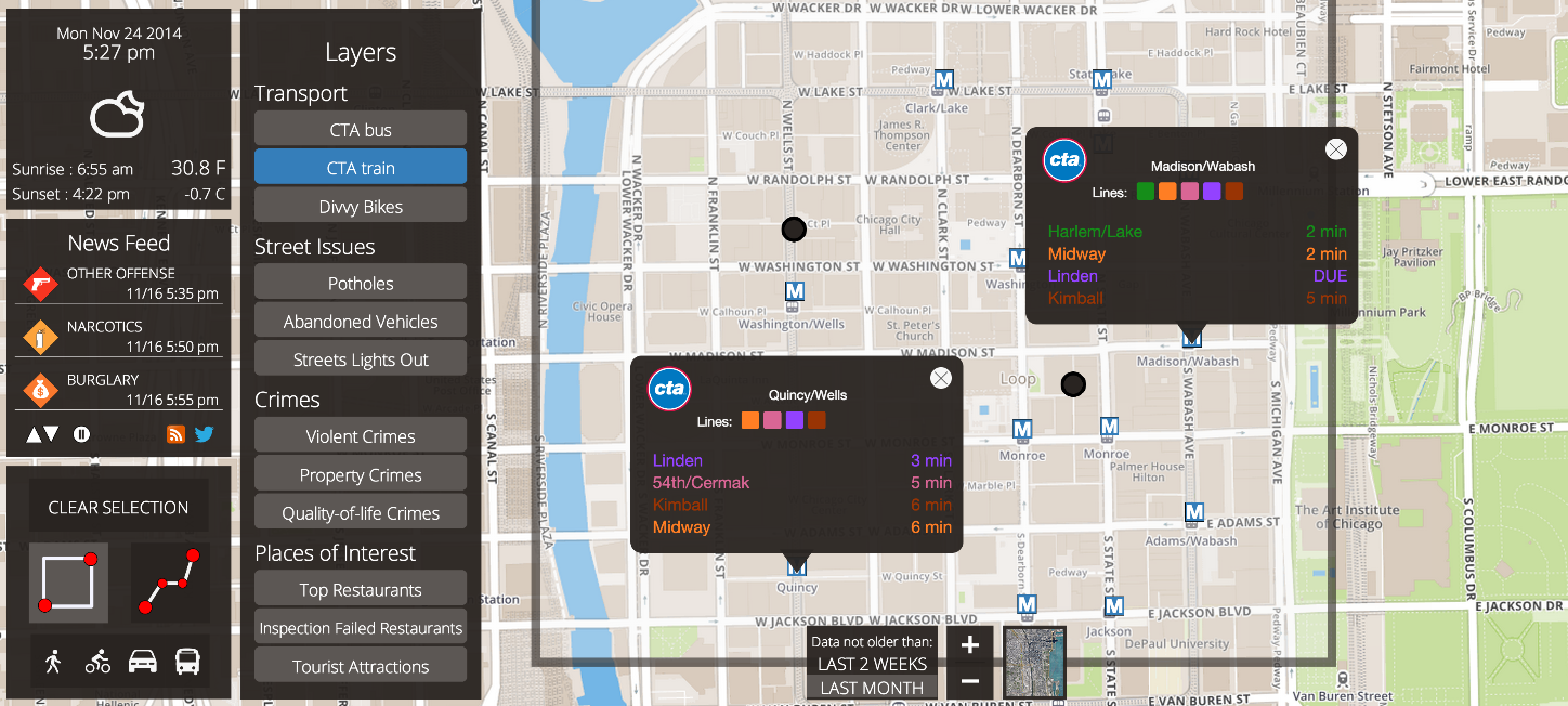
CTA train
By selecting the “CTA train” label, the layer of CTA trains is activated. It displays the train stations as
markers on the map.
By clicking on one of these markers, a popup is shown. It contains the name and ID of the selected station as well as the lines that pass through that station. The predictions of the next 4 trains with the respective information are displayed too.
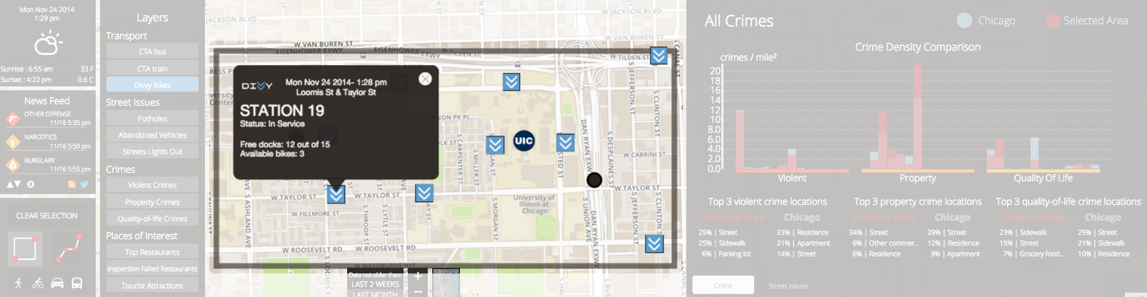
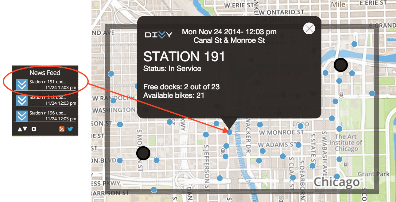
Divvy Bike
By clicking the "Divvy Bikes" label, the layer that shows all the Divvy stations is activated.
Clicking on the markers, both the circle when the zoom level is low and the icon when the zoom level is high, will show a popup with the information related to that station. In particular will be shown the number of free docks available at the station, and the number of bike available for picking.
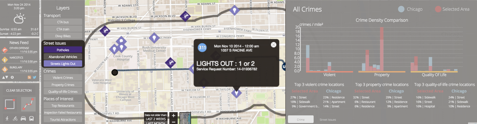
Street Issues
This macro category has been divided into 3 subcategories: potholes in the street, broken street lights and abandoned vehicles on the street. Each of them is activated by clicking on the corresponding button, has two different icons that change with respect to the zoom level, and can be clicked to show a popup that gives a bunch of information about the specific issue.
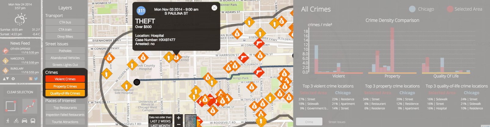
Crimes
Also this macrocategory has been split into 3 different subcategories:
- Violent Crimes are crimes in which an offender uses or threatens force upon a victim. (Battery, Homicide, Abuse etc..)
- Property Crimes that are crimes that do not necessarily involve harm to another person. Instead, they involve an interference with another person’s right to use or enjoy their property (Theft, Burglary etc..).
- Quality of Life Crimes Crimes against the public include offenses that affect the quality of life, group violence such as gang activity, and vice crimes.(Gambling, Prostitution and so on...)
Each of them is activated by clicking on the corresponding button, has two different icons that change with respect to the zoom level, and can be clicked to show a popup that gives a bunch of information about the specific issue.
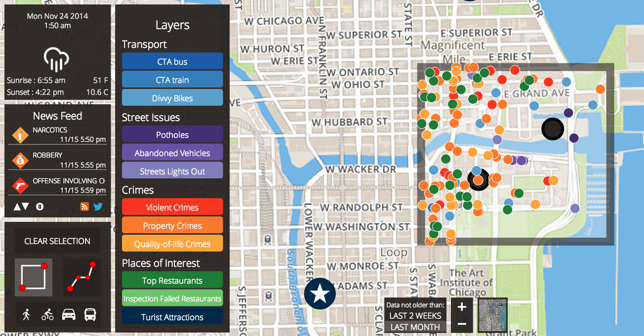
Places of Interest
This application is mainly supposed to be used by tourists, so having a list of important places to show is fairly meaningful. This layer is very similar to the ones described above, whit the only difference that when the marker is clicked, other than showing a popup with relevant information, the place is also used as a point to build a path trough it.
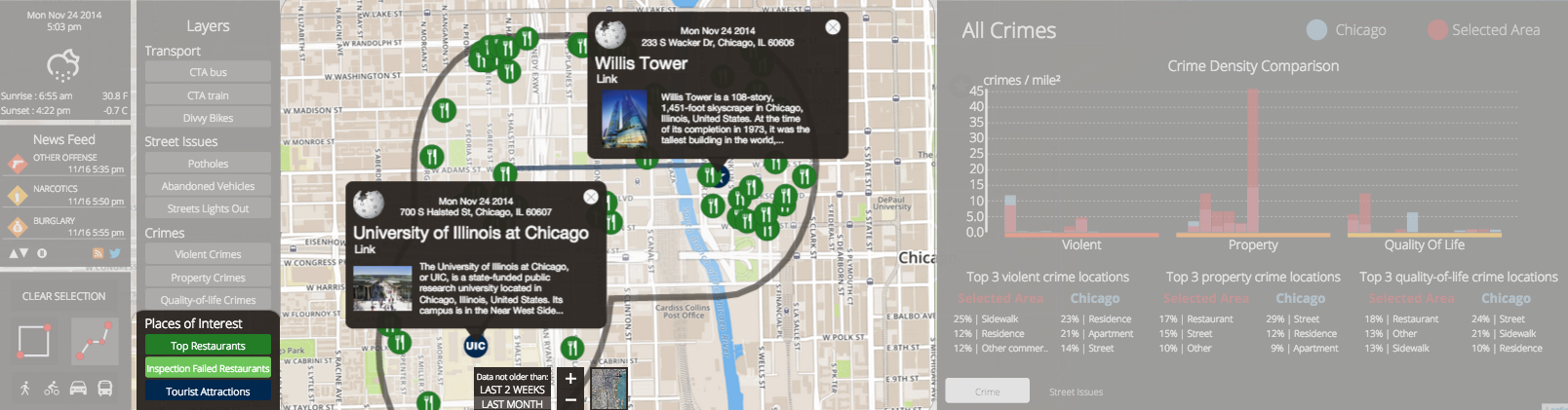
In this image we can see the path from UIC to the WIllis tower, with the restaurants displayed in between
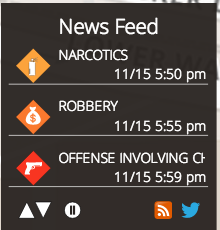
Real-Time notifications: Newsfeed
To highlight any new relevant data that has appeared while the application has been running, we have
introduced a newfeed.
The newsfeed has three rows, each one for a news, and a new row is added going down the feed whenever a new
relevant change happens to the enabled data (through a layer) in the selected area.
In the following example 2 divvy bikes stations have had a change of number of bikes and the feed notifies it.
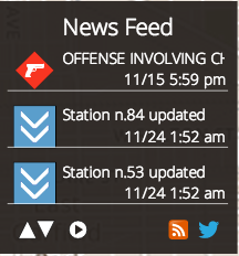
If the user is interested in a specific news, he can click on the icon in the feed and the correspondent popup of that event will automatically appear on the map, so that the user can have more information both on the location and the details of the event.
The newsfeed has also some controls to allow for a complete personalization at user's discretion:

In order from the left:
- Up and down arrows: to scroll the feed, going down for more recent uodates, up for past news. By default every time a new news arrives, the feed skips automatically to the first page to let it be visible.
- Play/Pause button: sometimes you may want to pause the real-time need to always see the last updated data. In this case you just have to pause the stream: the new news will continue to be fetched but the feed won't automatically skip to display them: the user can scroll through the past news to see what happened a few minutes/hours from the present, which can be useful since it is always a near-real-time information which otherwise would have been missing.
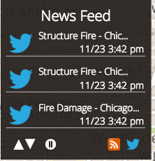
- Change of stream: the RSS button and the Twitter button allow to switch between two modes for the newsfeed: the first is the standard mode which shows relevant news about changes of data for the selected layers, the second one shows the stream of real-time tweets.
Here's the Twitter feed:
For the criterion with which to fetch tweets, we realized that geolocalized tweets are not much interesting for
the purposes of our app, since they are posted by random people who are talking about any kind of topic
throughout the city.
We discovered, instead, that there are some particular Twitter keywords and hashtags which localize the
topic and location of the tweets even better. In fact, we look for tweets with the keywords "Breaking Nes" and
"Chicago" so that only relevant updates for important facts happening in the city are retrieved.
The user can see the first words of the tweet in the feed and then click on the Twitter icon to open a popup
which shows the complete tweet:

In this example, the tweet notifies that a fire has been reported in Chicago and there's also a link if the user wants more information about that.
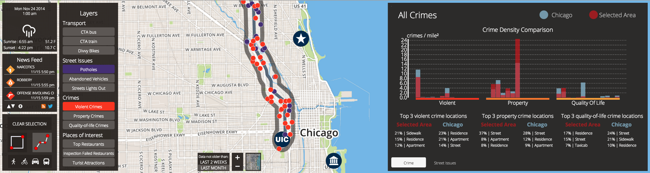
Charts
Charts have been designed to show a general overview of Chicago crime data and general street
issues and to allow comparisons between a selected area and Chicago as a whole.
The charts panel is placed on the right part of the screen and offers two views, one regarding the crime
data and the other regarding street issues; By clicking the two buttons on the bottom part of the
chart panel user can switch between the two views.
Buttons to switch between crimes view and street issues view
Crimes charts
In the crime view the user can look at crime data in two different ways. The chart at the top shows crime data in term of crime density (crimes per squared mile); In this way it is possible to investigate whether a given area is more criminal than Chicago as a whole. Crimes are divided in three macro category, namely violent crimes, property crimes and quality of life crimes as shown by the chart groups.
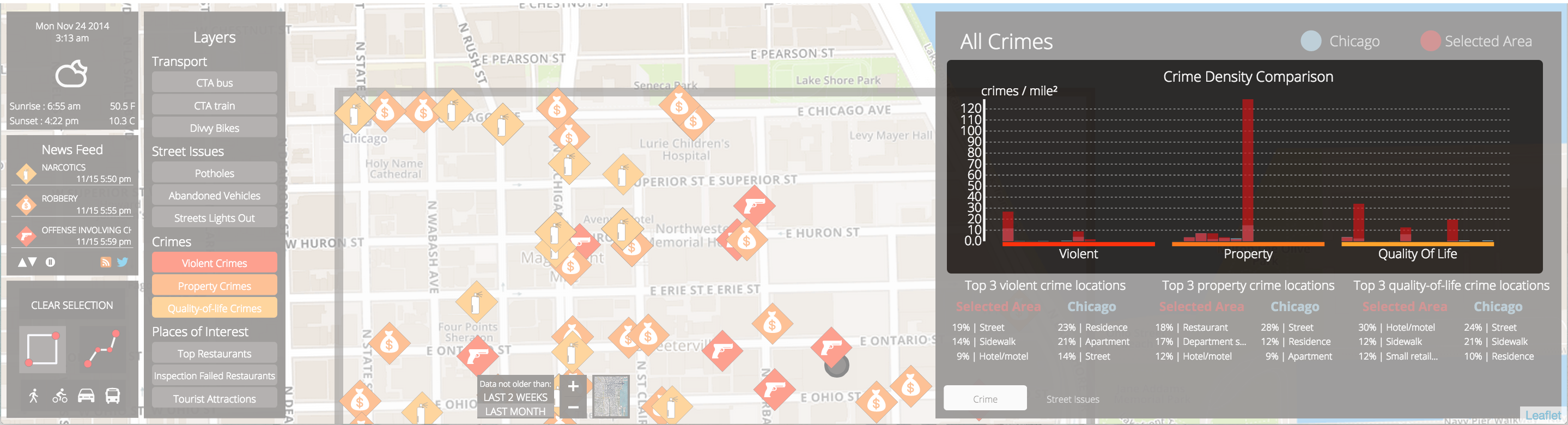
Column chart that shows crime density of the selected area and of Chicago as a whole.
By clicking on the columns of the charts a tool tip appears to show the name of the specific crime.
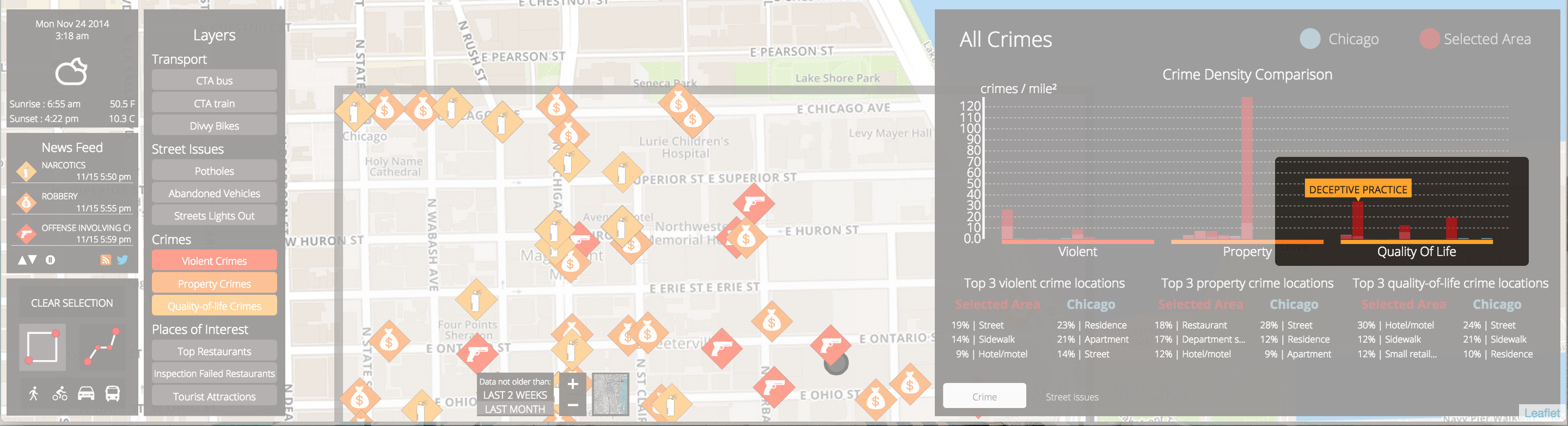
Tooltip that shows which crime the column refers to.
At the bottom part of the crime view crime is shown by means of most frequent crime locations. The tables show which locations are more frequent for a given category of crime, both for the selected area and for chicago as a whole. Percentages of the locations frequency are also shown.
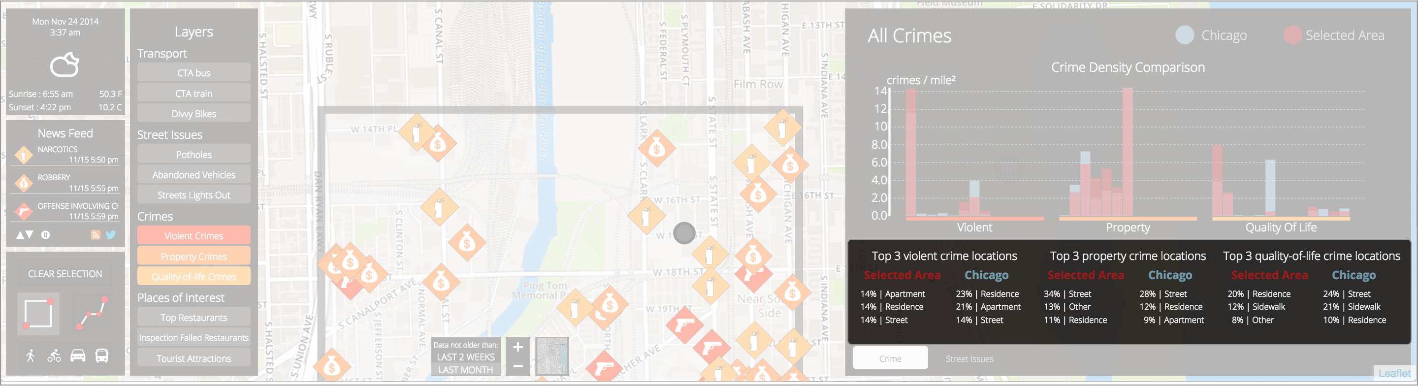
Most frequent crime locations by category and area.
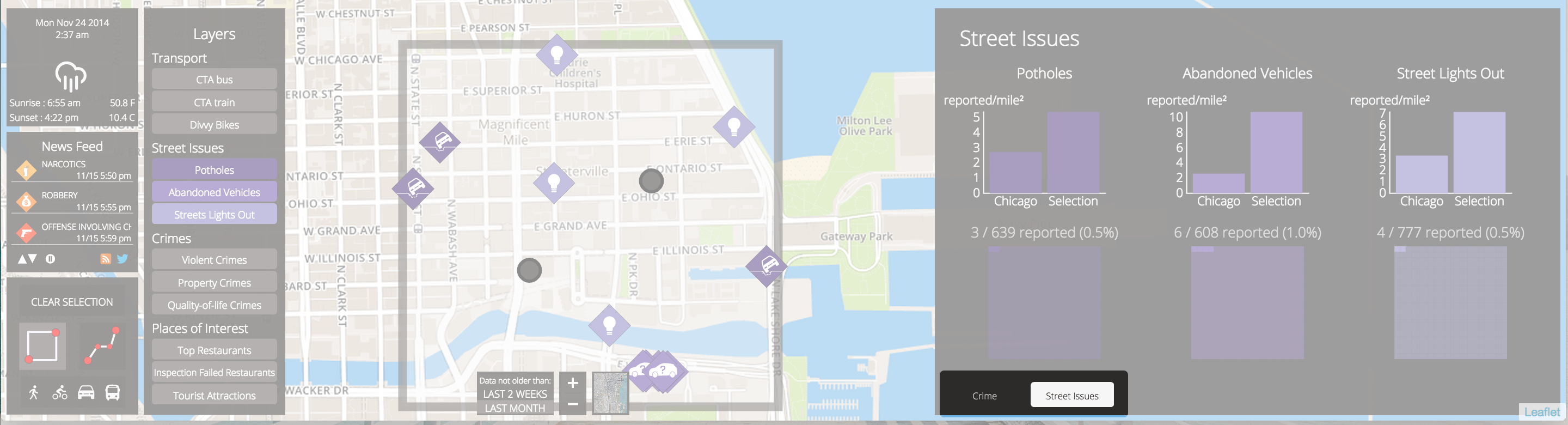
Street issues charts
In the street issues charts data about potholes, abandoned vehicles and street lights out are shown. Charts at the top shows the various pieces of data by means of density (reported cases per squared mile) both for Chicago as a whole and the selected area.
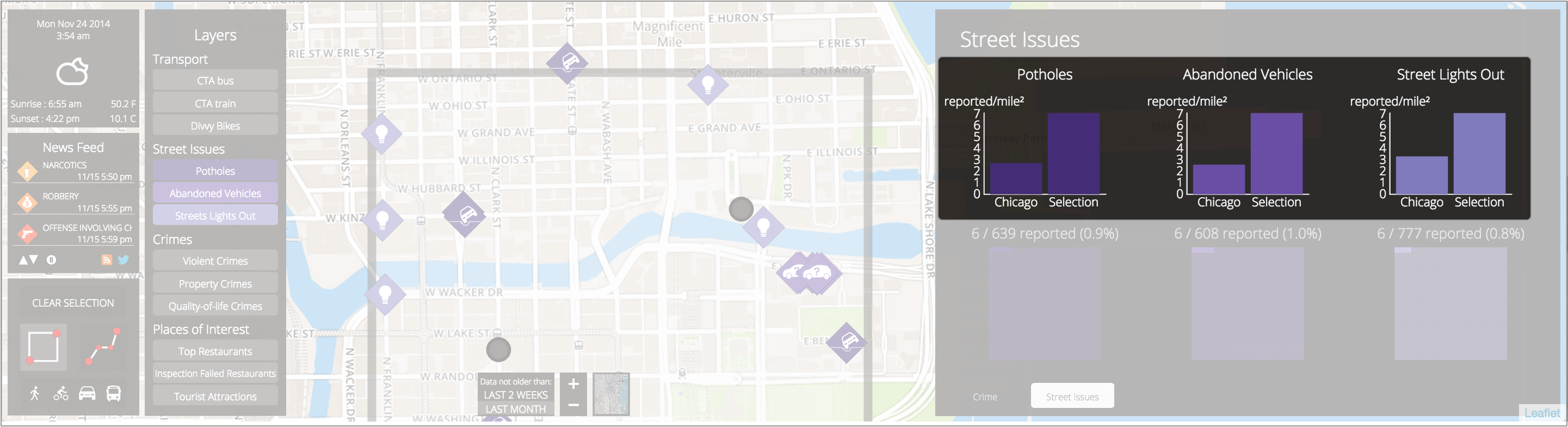
Column charts that shows reported cases per squared miles respectively for potholes, abandoned vehicles and street lights out.
At the bottom part of the street issues view the raw numbers are shown in term of reported cases in the selected area, all the Chicago reported cases and the percentage of the Chicago cases in the selected area. The raw data is represented also with matrix plots in which the whole plot represents Chicago reported cases and the highlighted squares represent the cases within the selected area.
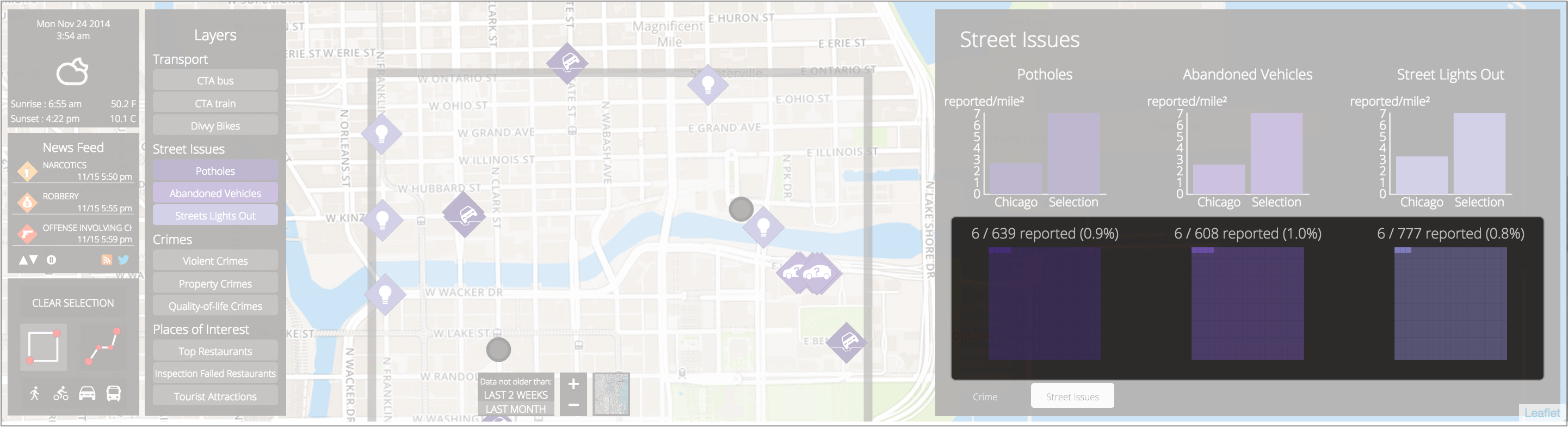
Raw data for potholes, abandoned vehicles and street lights out is shown in term of cases in the selected area / chicago cases and the percentage. These pieces of data are represented in the matrix plot.